Without doubts, data is king in today’s world. But it is also every business’ biggest challenge. Often, businesses can be overloaded with data and they have a hard time managing and obtaining valuable insights from it. This makes analyzing the data a tiring and monotonous task. Hence with more data, comes the need for better ways to visualize it. This is exactly what data visualization does!
What is data visualization?
Data visualization can be used to help understand and communicate information in a simple, and concise way. It is the process of converting datasets into visual graphics making them easy to access and navigate. This way you can quickly see patterns that may not be apparent when looking at raw data. Additionally, these illustrations can help understand complex information faster and easier than text alone.
When it comes to business analytics, there are many different types of visualizations that businesses can use to gain insights into their operations. These include scatterplots, bar charts, and line graphs, among others. This, in turn, helps you work on improving your service or product, and win profits.
5 ways in which data visualization can benefit your business operations
Data visualization can play a critical role in streamlining your business operations. By understanding how to use data visualization tools effectively, you can improve communication within your team, manage data more efficiently, optimize processes using and make better decisions based on the information.
Here are five easy ways to improve your business operations:
- Analyze data easily
Gathering accurate data is necessary for every business. But your success lies in how well you use this data. It is necessary to take the time to analyze the gathered data and identify where your business should focus its efforts next.
Data analysis is made easier with effective graphics and visual representations. This way you get insights into trends, patterns, and correlations that could otherwise be difficult to discover through statistical analysis. Hence, data visualization helps you make informed business decisions.
- Compare data effectively
One of the most important aspects of data analytics is allowing users to easily compare different sets of data. This is particularly important when it comes to making informed decisions, something that’s easier to do when data is presented visually.
Visually presenting data allows for easy comparison of different metrics over time. This can help identify any shifts or changes in behavior that might indicate an issue with your marketing efforts, sales strategy, or manufacturing process. With this information, you can decide where to allocate your resources next without wasting time and energy on business areas that are not yielding results.
- Present data accurately
Most often, statistics can be difficult to understand. That’s where visual graphics come in. Data visualization provides a quick snapshot of important performance metrics in a way that is easy to understand and share with other members of your team or outside parties. This helps to keep everyone up-to-date on key developments and ensures coordinated action is taken when necessary.
- Coordinate effectively
In today’s modern business, teams that can effectively communicate and coordinate are in a much better position. Is your team struggling to stay on track with data-heavy projects?
Dashboards, infographics, and other visual graphics provide instantaneous data updates across multiple departments. It enables effective communication between different parts of your organization by making insights easier for everyone involved to understand.
- Build a plan
Your business operation improves when specific areas such as logistics or inventory management are easily recognizable. Thanks to trend mapping and scenario planning techniques!
Visualizing data helps you and your team see the big picture and improve your understanding of the situation. This way you can avoid making the same mistakes in the past, and move forward with a plan that is tailored to their specific needs. It helps to plan the future course of action by imagining potential outcomes and mitigating unforeseen scenarios before they become costly issues.
Which industries do data visualization cater to?
Data visualization can be used in a variety of industries to help make better decisions. Some of them are:
Marketing
Marketing is all about getting your products or services in front of the right customers. And data is the key to engaging effectively with your customers. However, if you’re not using the right data to make informed decisions, your marketing efforts will be fruitless. The significant step in marketing is to gather relevant data about your consumers and track how they are using the products and services. By visually presenting the gathered data, you can create engaging and visually appealing content and better understand the target audience.
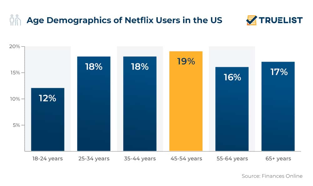
Here’s a bar graph representation of the age demographics of Netflix users in the US. By understanding the age range, current trends, and interests of the users they can produce content that appeals specifically to them. This kind of personalized marketing ensures that businesses reach the right people with the right message at the right time.
Retail
Retailers are always looking for ways to improve their customer experience. The importance of good data in retail cannot be overstated. Without it, retailers may not be able to make informed decisions about what to offer customers or how best to reach them. Converting your data into visual graphics makes product research, inventory management, marketing planning, and decision-making easy and effective.
For example, Walmart broke down its sales data into graphs to help them understand how its products are selling and where they may need to make changes to sales strategy. This in turn improved their business operations.

Healthcare
Today, healthcare has become increasingly data-driven. It is essential for hospitals and medical professionals to have access to reliable data in order to provide optimal care for their patients. And there are many benefits that come with this trend. From managing patient data to understanding the correlations between various factors, effective data visualization is essential in helping healthcare professionals make informed decisions.
For example, converting data into a line graph makes it easy for healthcare providers to identify the changes and trends that they may not have been able to find otherwise.

Summary
At last, as you can see there are many different data visualization methods that can be used to understand and present information in an effective way. Some popular approaches include bar graphs, pie charts, line graphs, and scatter plots. These methods help you create compelling visuals that help communicate your insights.
For example, bar graphs are often used to display categorical data such as income or age groupings. Pie charts help users visualize how various parts of a meal contribute to overall caloric intake. The line graph displays trends over time by plotting points on a graph in real-time mode. Scatter plots allow you to investigate relationships between two sets of variables visually by displaying them as dots on one plot versus another plot respectively.
Hence, the right method depends on your requirements, audience, and the topic of information you want to share.
At Xtract.io we help you leverage these data visualization methods effectively, better understand complex datasets, and make informed decisions about business strategies!